Color is finally OK
A solo developer's blog post replaced sixty years of color science. Most designers and developers missed it.
A couple of weeks ago, I was scrolling through the Tailwind v4 documentation looking for a red. I saw this:
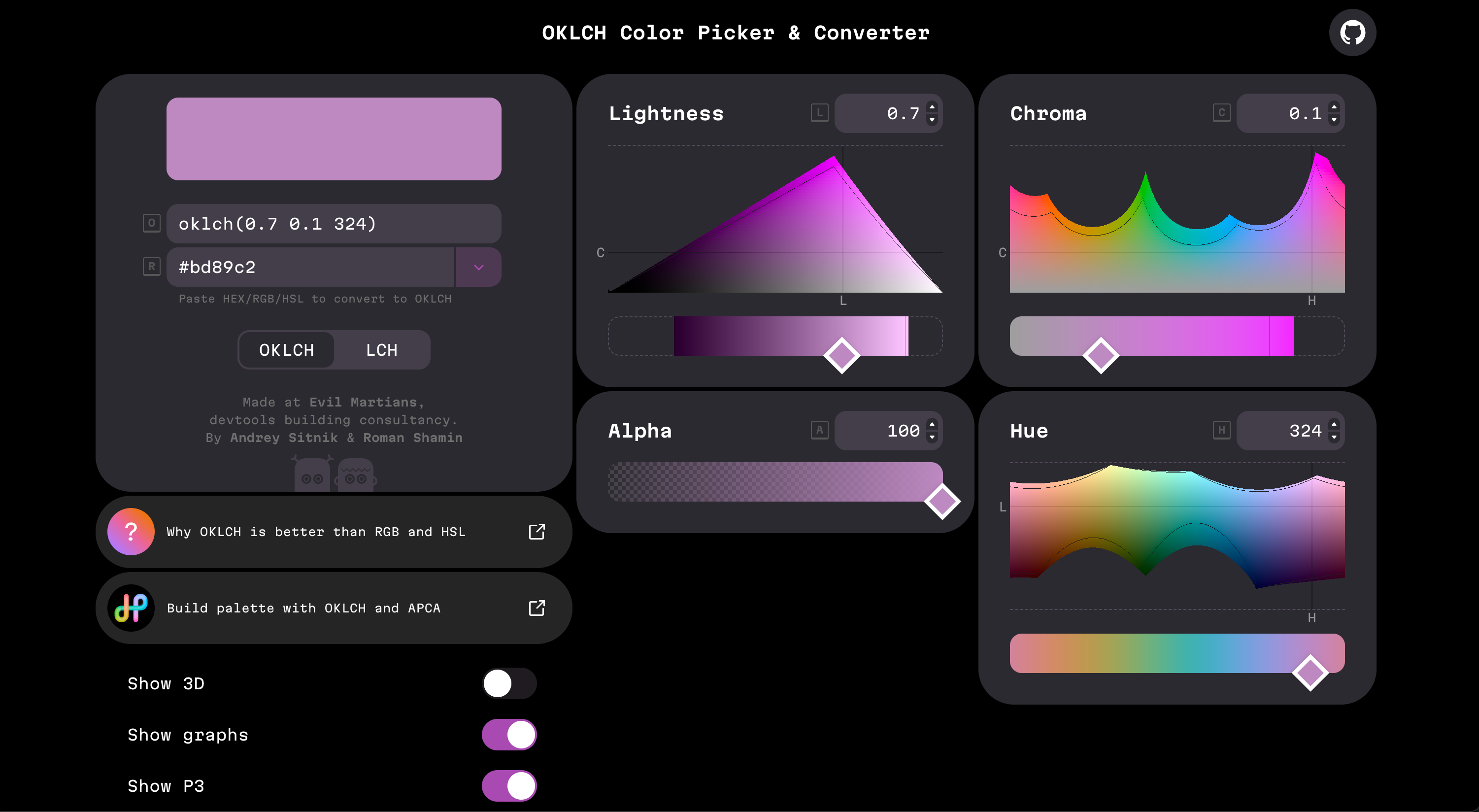
--color-red-500: oklch(0.637 0.237 25.331);
Not hex. Not HSL. Something else.
I stopped for a second and tried to parse what I was looking at. I had been building design tokens for over a decade at that point, and I did not recognise the syntax. I had heard of OKLCH before, the way you have heard your fridge has a freezer, peripherally, not as something you think about. And now the most popular CSS framework in the world has made it the default for every colour in its palette.
No announcement. No tweet. No migration guide apologising for the change. Just the new values, sitting there as if they had always been there.
I closed the page, made a coffee, and spent the next three days reading everything I could find about this format.
The thing every designer knows but almost nobody says out loud
HSL is a broken colour model.
Pick a yellow at 50% lightness. Pick a blue at 50% lightness. Look at them. The yellow glows. The blue is almost black. Both have the same value in the L slot.
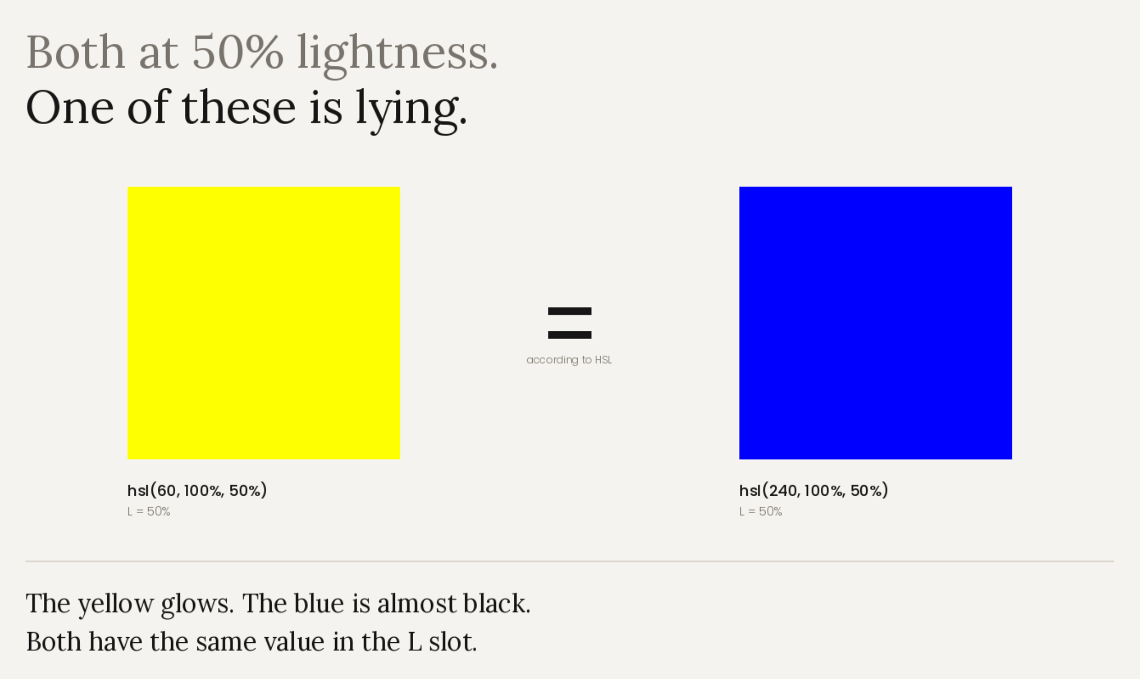
This is not a bug in your monitor. This is HSL working exactly as designed. Its lightness scale is a mathematical midpoint between the minimum and maximum values of the R, G, and B channels. It has nothing to do with how light a colour actually looks.
The practical version of this is the thing every designer has been fighting for years. Darken a blue by twenty points of lightness, and it drifts to purple. Generate a gradient from yellow to blue in RGB, and the middle dies in a dead grey. Try to build a palette where every 500 shades has the same perceived weight across red, blue, green, and grey, and you cannot, because the maths does not match the eye.
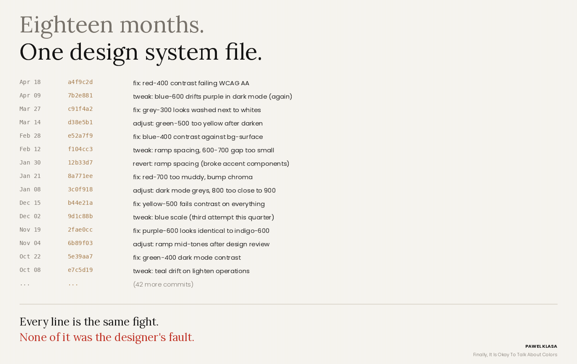
Every designer knows the workaround. Tweak. Check contrast. Check dark mode. Adjust. Retest. Ship. Three months later, someone asks why the 300s look washed, and the 700s look muddy, and you go back in and do it all again.
The amount of unpaid labour we have done to compensate for a badly calibrated colour model is enormous. Almost none of us ever questioned whether the tools should be doing this differently.
Albers already said this in 1963
"In visual perception, a color is almost never seen as it really is, as it physically is. This fact makes color the most relative medium in art. In order to use color effectively, it is necessary to recognize that color deceives continually."
These are the opening words of Interaction of Color, the book Josef Albers published at Yale in 1963. Albers was a German-American painter and professor who had spent his whole career proving this single point. Same grey on a blue field, same grey on a yellow field, two distinctly different greys. The wavelength is identical. The perception is not.
He wrote that sixty-three years ago. Every designer I know has read the book. And then we all went back to our editors and wrote our colours in HSL.
This is not a small oversight. This is sixty years of colour perception research ignored by the tools, because the maths refused to describe what the eye actually does.
The Swedish game developer
In December 2020, a software engineer named Björn Ottosson published an article on his personal blog.
He was not a colour scientist. He had worked on FIFA, Battlefield, and Need for Speed at EA DICE in Stockholm. He was an engineer who kept hitting the same problem at work.
"Sometimes I wanted to do simple color manipulations like making a color darker or changing the hue. I researched existing color spaces and how good they are at these simple tasks and concluded that all of them are problematic in some way."
So he built a new one. Ten lines of code. He called it Oklab.
The name was a joke. "Ok" because the existing colour spaces were not okay for what he needed, and his goal was to make one that is. He did not call it Ottosson Lab. He called it Ok.
Here is where the story gets genuinely strange. Chris Lilley at the W3C read the blog post. Simon Fraser at Apple had tweeted about it. Lilley dug into the paper, asked Ottosson some questions, and implemented the algorithm in Color.js with Lea Verou. Together, they started pushing for Oklab to be included in CSS.
Photoshop adopted Oklab as the default method for interpolating gradients. Unity integrated it into their engine. Godot's colour picker started using it. By December 2021, Oklab and its cylindrical sibling OKLCH were part of the CSS Color Module Level 4 draft. By 2023, every major browser supported them.
One engineer, on a side project, replaced sixty years of institutional colour science in the tools the world's designers and developers use every day. The shift happened because his ten lines of code solved problems that the academic models had left unsolved.
What OKLCH actually does
OKLCH stands for Ok Lightness Chroma Hue. Three numbers, each doing exactly what the name says.
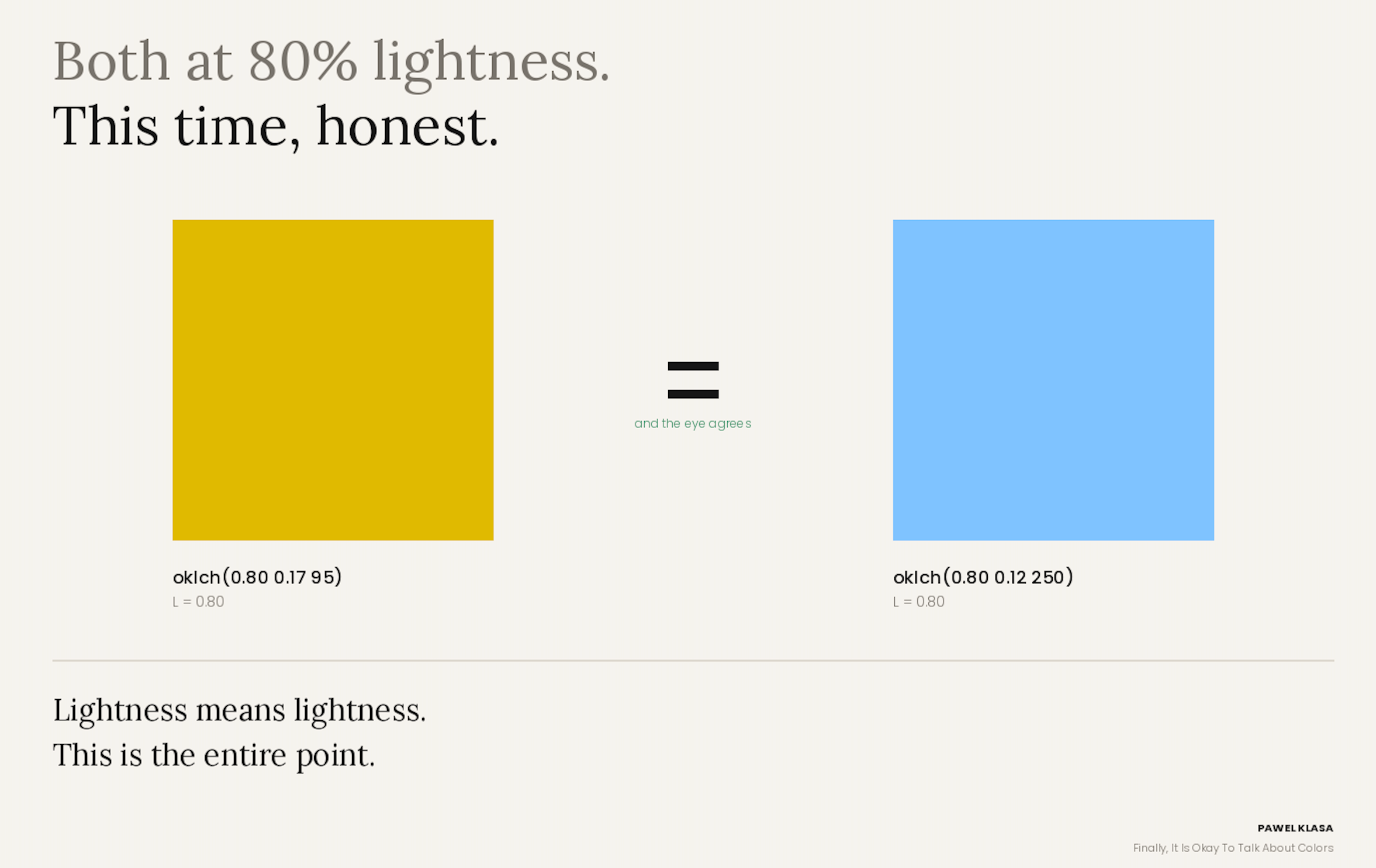
Lightness means lightness. Perceived brightness. A yellow at 70% lightness and a blue at 70% lightness look approximately equally bright. This is the entire point. This is what makes the rest work.
Hue stays where you put it. Darken a blue, and it stays blue. Lighten a red, and it does not drift to pink.
Chroma is honest. It tells you the maximum colourfulness available for a given hue at a given lightness, rather than pretending every hue can reach full saturation the way HSL does.
When you rebuild a palette in OKLCH, the things that were hard become arithmetic. Accessible contrast pair? Pick two values whose L differs by 0.4 or more. Five-step ramp? Space them evenly on the L axis. Dark mode? Invert the scale. Gradient without a dead grey middle? Just interpolate in OKLCH.
The work goes away. Not because a clever tool solved it, but because the colour space finally matches the eye.
The lineage goes back to 1905
The thing that surprised me most, reading into this, is that the intellectual foundations of OKLCH are not new at all.
Albert Munsell, working in Boston in the first decade of the twentieth century, built a colour system around three independent perceptual dimensions: hue, value, and chroma. He published it in 1905 in a book called A Color Notation. The dimensions were orthogonal because perception treated them as orthogonal. His system was not theoretical either. He built it by showing colour samples to human observers and adjusting the spacing until the perceived steps between neighbouring chips felt even.
OKLCH is, in a direct unbroken line, the mathematical descendant of Munsell's 1905 system.
In between sits CIELAB, which the Commission Internationale de l'Éclairage published in 1976. CIELAB was the first serious mathematical colour space designed for perceptual uniformity. For decades, it was the reference. Print, photography, film correction, and academic colour science. But it had known flaws. The most famous is what the literature calls the blue turn. Blue-to-white gradients in CIELAB drift towards purple because of nonlinearities in how the space models hue. If you have ever built a dark mode and watched your blues go purple, you have met this problem personally.
Colour scientists spent forty years trying to fix it. CIECAM02, CAM16, IPT, ICtCp, Jzazbz. Each one addressed specific flaws in CIELAB. Almost none of them made it into the tools designers actually use, because they were mathematically complex and needed careful handling of viewing conditions.
Then Ottosson wrote his blog post.
Why most designers missed it
OKLCH has been in every major browser for three years. It has been part of the CSS standard since 2021. Photoshop has been using Oklab for gradients for longer. Tailwind v4 shipped it as the default for the entire palette in early 2025. shadcn/ui uses OKLCH for its theming. Every AI coding assistant now outputs OKLCH by default because every modern codebase it was trained on uses it.
And most designers still do not know any of this.
I did not know. I build design systems for a living. I read design blogs. I follow design on Twitter. I follow the people I am supposed to follow. The shift happened in the background while I was busy patching around HSL's bad maths.
I think this is partly because the problem OKLCH fixes is the kind you stop noticing after years of fighting it. Broken gradients. Drifting hues. Inconsistent contrast. Design systems that fall apart in dark mode. We built elaborate tooling to compensate. Contrast checkers. Palette generators. A thousand articles about how to do dark mode correctly. The pain was so constant that we stopped registering it as pain.
It is also partly because the story is quiet. A Swedish engineer posts a blog. The W3C picks it up. Tailwind changes a default. There was no keynote. No framework launch. No announcement campaign. The revolution happened behind the industry's back.
What to do about it
Open your current design system. Pick one colour scale to rebuild in OKLCH. Not the whole palette. One scale. Start with the primary.
Set your 500 value. Move the L upward in equal steps to get 50, 100, 200, 300, 400. Move it downward in equal steps to get 600, 700, 800, 900, 950. Keep chroma roughly constant. Keep hue constant.
The first time you do this and see the ramp just work, every step evenly spaced by eye, no tweaking required, the case for the rest of the system makes itself.
Then do it for your secondary. Then the rest. Then build a dark mode by inverting the L scale and watch it behave.
Ottosson's ten lines of code are not going away. The tools have already been agreed upon. Albers would have recognised it. Not a revolution. A correction.
Colour is finally doing what he always said it would.
If you want to actually try the techniques from the article, I built a free companion tool suite: ramps, gradient comparison, contrast finder, and a light/dark theme builder.
Live here
Would love your feedback.
Sources
Björn Ottosson, "A perceptual color space for image processing," personal blog, December 2020.
Philip Jägenstedt, "Interview With Björn Ottosson, Creator Of The Oklab Color Space," Smashing Magazine, October 2024.
Josef Albers, Interaction of Color, Yale University Press, 1963.
Albert H. Munsell, A Color Notation, Boston, 1905. (public domain, full text on Internet Archive)
Chris Lilley, "Better than Lab? Gamut reduction in CIE Lab and OKLab," W3C Workshop on Wide Color Gamut and High Dynamic Range for the Web, 2021. y
Tailwind CSS team, "Tailwind CSS v4.0" release notes, January 2025.
Andrey Sitnik, "OKLCH in CSS: why we moved from RGB and HSL," Evil Martians blog, 2023.
Eric Portis, "Okay, Color Spaces," February 2024.
Источник: https://medium.com/design-bootcamp/color-is-finally-ok-82f368f3408c